Cinema Meridian
Schedule family-friendly fun at the movies, on your own time
Design Challenge: Design a ticket ordering flow for a movie theater

Project Background
My Role
For my second UX design project, I worked on designing for a responsive website for a fictional movie theater named Cinema Meridian. My goal for this project, and the issue I wanted to tackle, was providing a way for busy moviegoers to be able to preview movie information and reserve movie tickets quickly from one website through an account that is curated for them personally.
I worked as the lead UX researcher and designer for this project.
My responsibilities included:
Compiling research and interviews
Creating paper and digital wireframes
Conducting usability studies
Designing low and high-fidelity prototypes
Iterating on designs
Empathize
Research was conducted in the form of interviews and empathy maps were constructed to pinpoint who would be the target audience for Cinema Meridian’s website. Through this research, it was determined that a primary user group is busy families who do not have much time to find child-friendly activities to do together. This primary user group addresses much of Cinema Meridian’s customer base but research also revealed that some users only purchase one or two tickets at a time so they would prefer for the ticket buying process to be completed as clearly and quickly as possible.
Big interview take-away: Many of the potential users who were interviewed noted that they had children under the age of 10 so they mainly only went to the movies when they were going with their children.
User Research Study Details



User research helped narrow-down a potential user flow that centers the customer and their hope for a quick and simple navigation during their task.
Define
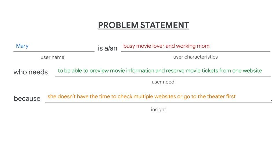
After I empathized with the user and organized all of the compiled user research, I shifted my focus to defining the overall purpose of this project. User pain points helped to showcase they key challenges of this project and the user journey map in particular helped to lay out the steps and overall process a user would be following to resolve these challenges. I created a goal statement that centers my target audience and their ultimate end goal of ordering movie tickets from a website.

Ideate
Once I defined the goals for this project, my next step was to start ideating. Because I moved from designing a mobile app in my first project to designing a website in my second project, I started with creating a sitemap to determine the structure for the website.

Hierarchical Website Structure


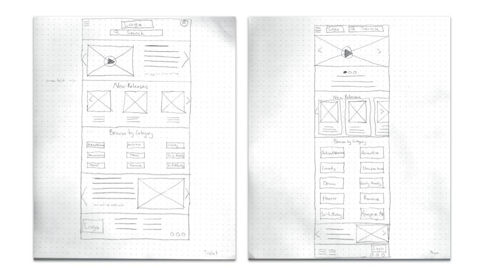
During the ideation phase, I sketched out designs for multiple versions of a responsive website and selected the elements that users are already accustomed to and that they most likely need in order to complete their user flow. That resulted in a final set of paper wireframes that I then transferred into digital versions. Before I moved on to digital wireframes though, I created sketches for the responsive website that would showcase who the website would appear on devices such as tablets and mobile phones. For these responsive designs, all of the necessary elements from the desktop website were included but they were rearranged in order to be easily read and viewed on different devices, based on their size.
Desktop Website Wireframe
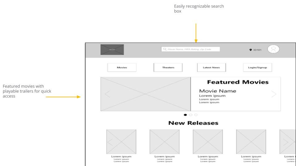
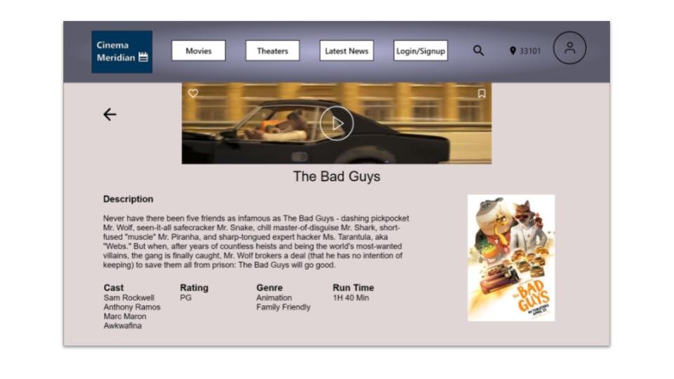
Once paper wireframes were created, I transferred the series of sketches to Adobe XD to turn them into digital wireframes. These digital wireframes were created with placeholder elements and text to help visualize the layout’s appearance on a desktop computer.

Mobile Website Wireframe
Mobile Website Wireframe
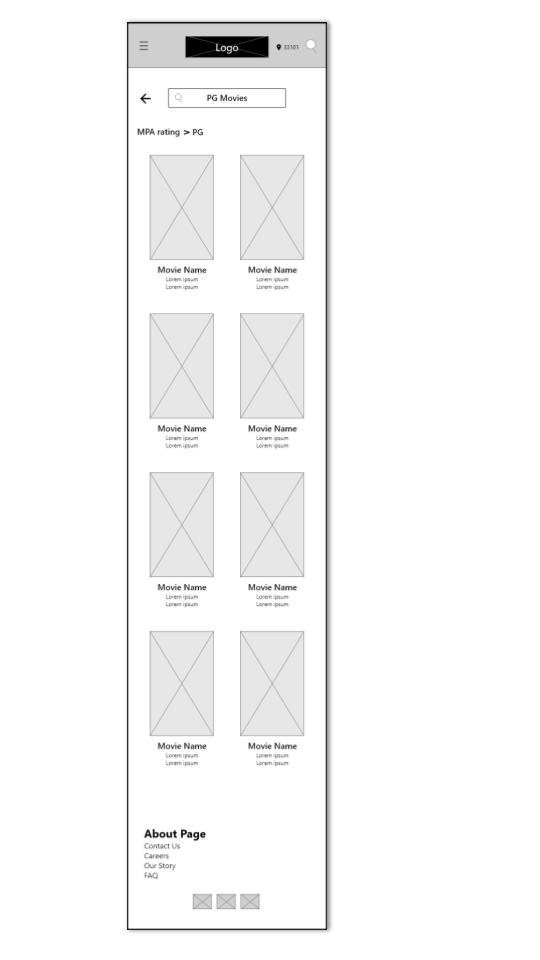
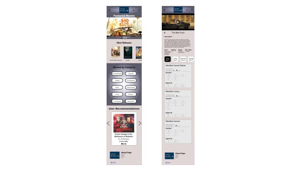
While creating the digital wireframes for the desktop website, I also worked on a mobile website that could be viewed on a mobile phone. Because most people access websites on their phones, especially when they are on-the-go, it is important to design a responsive website that adapts to the different sizes that devices come in.
Prototype
Digital wireframes were converted into a low-fidelity prototype that followed the user flow of purchasing 4 movie tickets, 2 for adults and 2 for children.
The high-fidelity prototype follows the same user flow as the low-fidelity version but the updated design includes necessary elements such as typography, colors, and images.
View Cinema Meridian’s high-fidelity prototype.
View Cinema Meridian’s low-fidelity prototype.

Lo-fi prototype

Hi-fi prototype
Test
A usability study was conducted between the creation of the lo- and hi-fi prototypes. This study was designed to examine the ease of use for the website when it comes to completing the user flow without any interference.


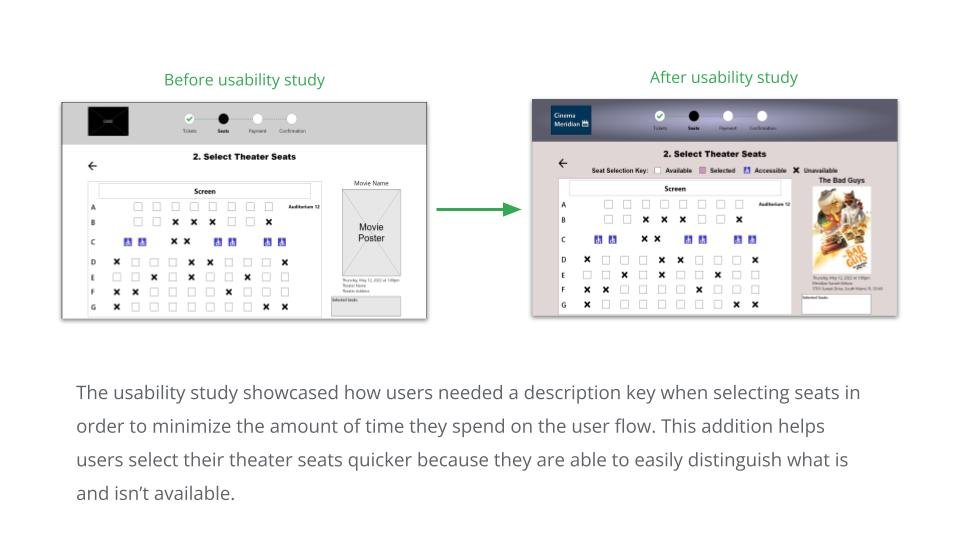
User insights were derived from the feedback participants provided in the usability study and the Priority 0 and 1 insights were used to improve the design during the high-fidelity prototype phase.
Mockups



Conclusion
Once the high-fidelity prototype was completed, I decided to reexamine the purpose of Cinema Meridian’s responsive website to make sure that I was both serving the target audience and creating a user flow that was without any hiccups. I determined that this website helps to provide users with a quick and streamlined process for purchasing movie tickets in advance to make sure they reserve their preferred screening time. It also allows users to review content such as movie trailers and descriptions to ensure that the content is suitable for them and their children while providing recommendations.


Final Thoughts: While working on the design for Cinema Meridian’s responsive website, I learned that in this fast-paced world, users are looking for a simple and quick process when they are trying to complete a task. This caused me to have to reconsider what elements users feel are essential in order for them to complete their desired tasks and omit those that didn’t focus on the user’s end goal.