Casa Italian
Track and order food on the go, at your convenience
Design Challenge: Create a mobile food ordering app for a fictional local restaurant
Project Background
My Role
For this design challenge, I focused on creating a mobile food ordering app where users can purchase meals for pickup and delivery. Although Casa Italian is a fictional restaurant, it was modeled after a local mom-and-pop Italian restaurant in my neighborhood that mostly services busy families.
I worked as the lead UX researcher and designer for this project.
My responsibilities included:
Compiling research and interviews
Creating paper and digital wireframes
Conducting usability studies
Designing low and high-fidelity prototypes
Iterating on designs
Empathize
In order to better understand the user and their problem that needs to be solved, preliminary research on the habits of users who utilize mobile food ordering apps was conducted. Interviews occurred and empathy maps were created to get a better understanding of who is the target audience and what do these users consider to be necessary features for an app such as this. Through this research, it was determined that there are two primary user groups this app can serve: busy families who do not have much time or energy to cook at home and single working professionals.
Big interview take-away: Most interviewees noted that they would like the ability to narrow down their search results in food ordering apps based on nutrition information, especially for their growing children’s health
User Research Study Details
![Google UX Design Certificate - User Journey Map [Javon Davis].jpg](https://images.squarespace-cdn.com/content/v1/61e96d939286237fa4a3a9a7/86431673-6a52-439d-a897-2aad4f1810a5/Google+UX+Design+Certificate+-+User+Journey+Map+%5BJavon+Davis%5D.jpg)
![Google UX Design Certificate - Problem Statement [Project 1].jpg](https://images.squarespace-cdn.com/content/v1/61e96d939286237fa4a3a9a7/069a93b2-3d50-44e1-8213-132581ea6b96/Google+UX+Design+Certificate+-+Problem+Statement+%5BProject+1%5D.jpg)
![Google UX Design Certificate - Portfolio Project 1 - Case study slide deck [Casa Italian Project 1].jpg](https://images.squarespace-cdn.com/content/v1/61e96d939286237fa4a3a9a7/29593ce6-ed1b-4b06-986f-22c430ecfe10/Google+UX+Design+Certificate+-+Portfolio+Project+1+-+Case+study+slide+deck+%5BCasa+Italian+Project+1%5D.jpg)
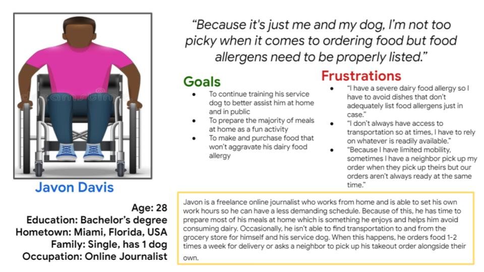
Developing user personas, journey maps, problem statements, and pain points was a tool to organize user research. This research helps to determine the product’s overall goal and purpose
Define
Once I determined the needs and pain points of the users I am hoping to design for, I set out to create a goal statement that would clearly encapsulate the purpose of this project. My decision was to center users who are usually forgotten when it comes to food ordering apps, those who have dietary restrictions because of allergies or personal preference. By designing for this particular group of users, I am aiming to cater to a forgotten corner of the market while also providing a new feature that existing food ordering app users might not have even realized that they would like to have.

Ideate
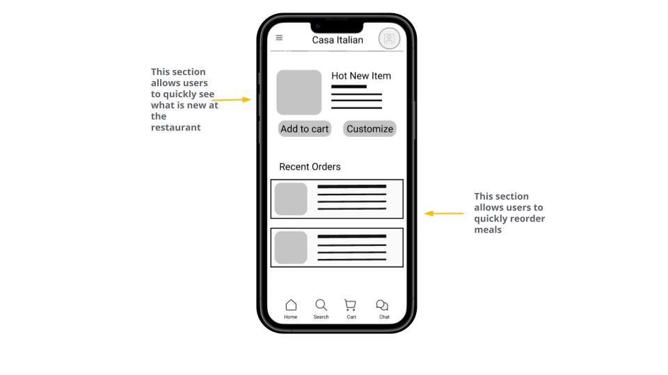
After the goals for the project were defined, I moved on to the ideation phase. Here, I began to brainstorm to narrow down the necessary elements that users will need in order to complete their user flow. I created a few paper wireframes and selected what I thought were the best elements in each to combine into one wireframe.


Once paper wireframes were created and organized, I began to design digitally in Figma. Here I focused on creating low-fidelity mockups that helped me estimate what the correct sizing and spacing should be for each element.

Prototype
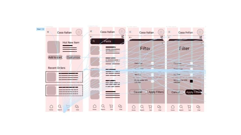
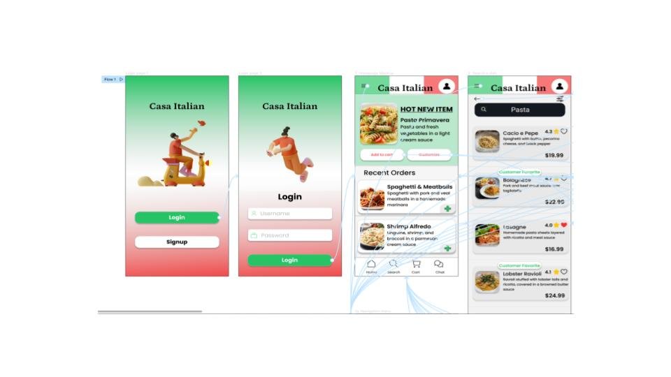
The low-fidelity prototype followed the primary user flow of filtering for a meal so the prototype could be used in a usability study with potential users.
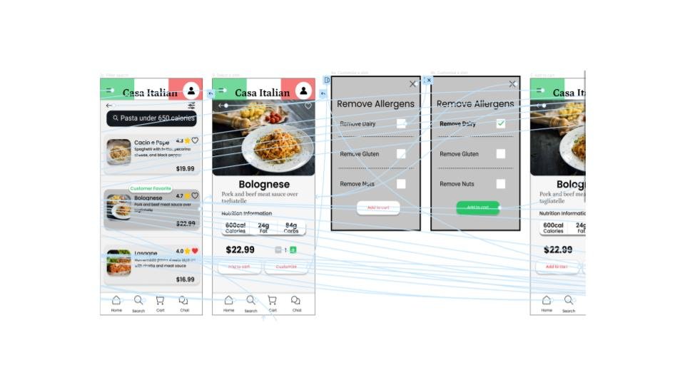
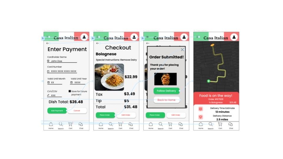
The final high-fidelity prototype allows users to customize and add a meal to their cart. It also provides users with the ability to track their order.
View Casa Italian’s low-fidelity prototype.
View Casa Italian’s high-fidelity prototype.



Test
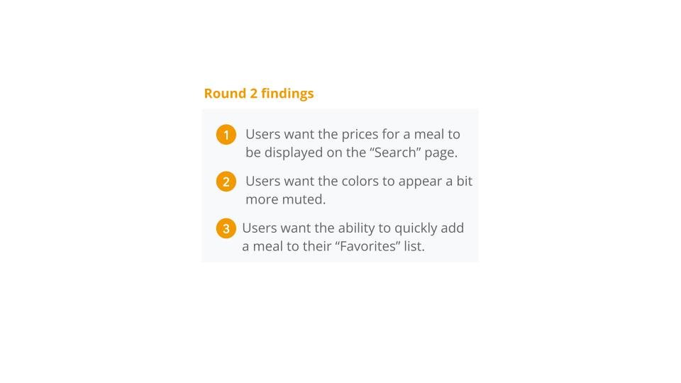
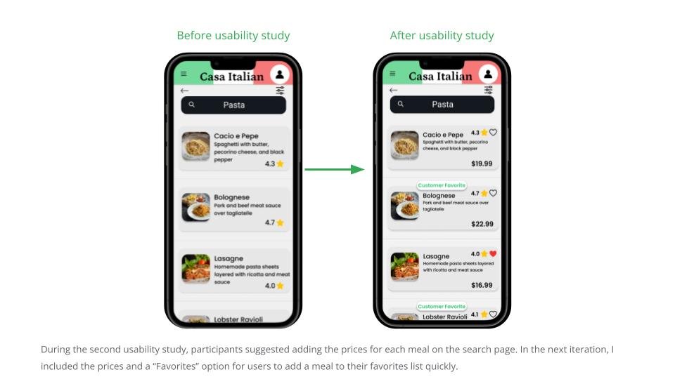
I conducted two sessions of usability studies. The first session occurred after the first low-fidelity prototype was created and helped improve the placement of some of the visual elements that were confusing for the user flow to be completed successfully. The second session occurred after the first high-fidelity prototype was created and was useful in helping to amend and increase the uniformity of each page. After working through the feedback of both usability studies, I was able to narrow down the insights below. These were Priority 0 and 1 insights that needed to be introduced sooner rather than later.

Implemented before hi-fi prototype
Implemented with first hi-fi prototype


Conclusion
Once the second usability study was completed and the most important feedback was organized into useful insights and implemented, I decided to go back and review whether or not the high-fidelity prototype for Casa Italian’s app actually solved the original user problem I set out to tackle. I concluded that the final version of this app helps to provide users with a quick and convenient way of ordering meals from Casa Italian without needing to speak directly with the restaurant. This allows users who need to make dietary and nutrition specifications for their meals to do so in a written, or visual, manner which increased the likelihood of the restaurant seeing and honoring the user’s requested specifications.


Final Thoughts: For my first introduction into the world of UX/UI design, this project challenged me to step outside of seeing myself as the target audience and concentrate on the people I am hoping to design for. I never realized that UX/UI is less about how flashy you can make a design and more about whether your design can actually make a positive impact in the lives of potential users. Throughout this project, I discovered that truly good designs are created when the user is your number one priority.