Always Pride
Connect with the LGBTQ+ community, any time, anywhere
Design Challenge: Design a social change app for users to connect with their community

Project Background
My Role
For my third UX design project, I worked on designing for a responsive website and mobile app that aims to fill a need that is missing for a particular community. In order to figure out what community I wanted to service, I decided to draw from current events and design for the LGBTQ+ community. Most mobile apps and websites for the community are centered around dating and I wanted to shift the focus to creating a platform for users who want to make more platonic connections. I named the website and app “Always Pride” to show that users should always take pride in who they are.
I worked as the lead UX researcher and designer for this project.
My responsibilities included:
Compiling research and interviews
Creating paper and digital wireframes
Conducting usability studies
Designing low and high-fidelity prototypes
Iterating on designs
Empathize
In order to clearly define who is the target audience, I interviewed various members of the LGBTQ+ community. I wanted to figure out what potential users were hoping to experience with an app/website catered to the community. After interviews were conducted, participant responses were organized into useful research such as empathy maps. Through this research, it was determined that Always Pride’s target audience is LGBTQ+ users who want to connect with other members of the community so that they can reach out for advice and mentor-ship or join local events to meet new people. The key challenge, or constraint, with this project was making sure that I focused on keeping the interaction between users as one of the most important elements because the purpose is to bring people together.
Big interview take-away: A lot of LGBTQ+ people have newly come out and want to create a community of people like them so they feel safe and loved but they don’t know where to find people such as themselves. This struggle was exacerbated by the current global pandemic and its limiting of human interaction.
User Research Study Details
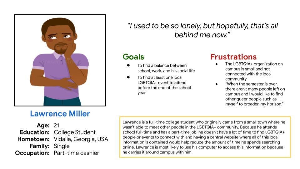
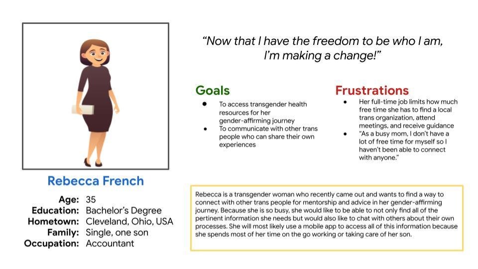
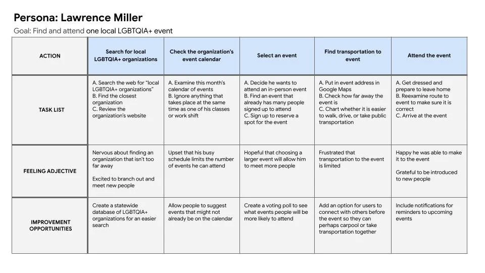
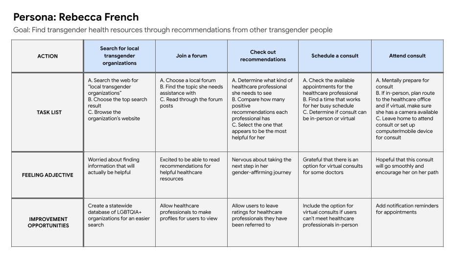


Personas helped organize user research and humanize the target audience so an empathetic user flow could be developed that would always center the user.
Define
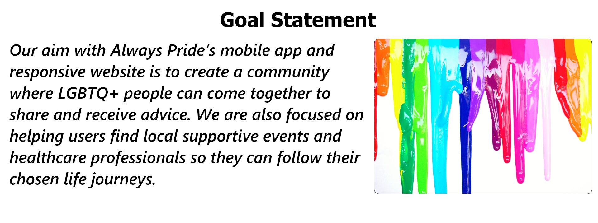
Organizing and reviewing all of the gathered user research was a gateway to developing a goal statement that would clearly define the point of creating an app and website such as Always Pride’s. The goal statement I created centers my target audience and their previously unfulfilled need in the marketplace. Although I wanted to make sure my mobile app and website provided an extensive service to users, I knew that one of my personal key challenges would be editing myself to make sure that I focused on what I could conceivable produce instead of what I hope I can produce.
Ideate
After the goal statement came together, the next step was ideation. Paper wireframes were created to help conceptualize some of the important elements that users would be looking for when trying to interact with new people. Some of these elements were an easily recognizable search box and the ability to browse by the categories Lesbian, Gay, Bisexual, Transgender, and Queer. The paper wireframes were consolidated into one final version where the most important elements for the user flow are located on the Homepage. I focused on creating wireframes for a mobile website initially.

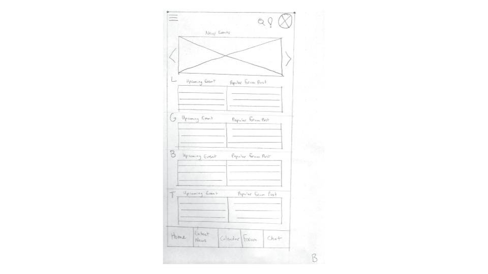
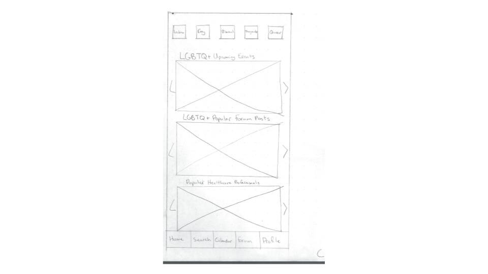
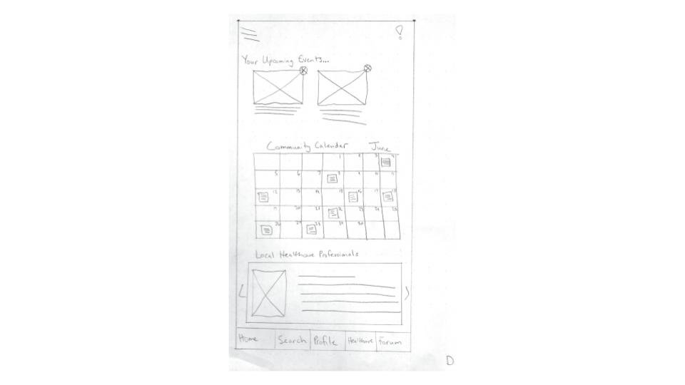
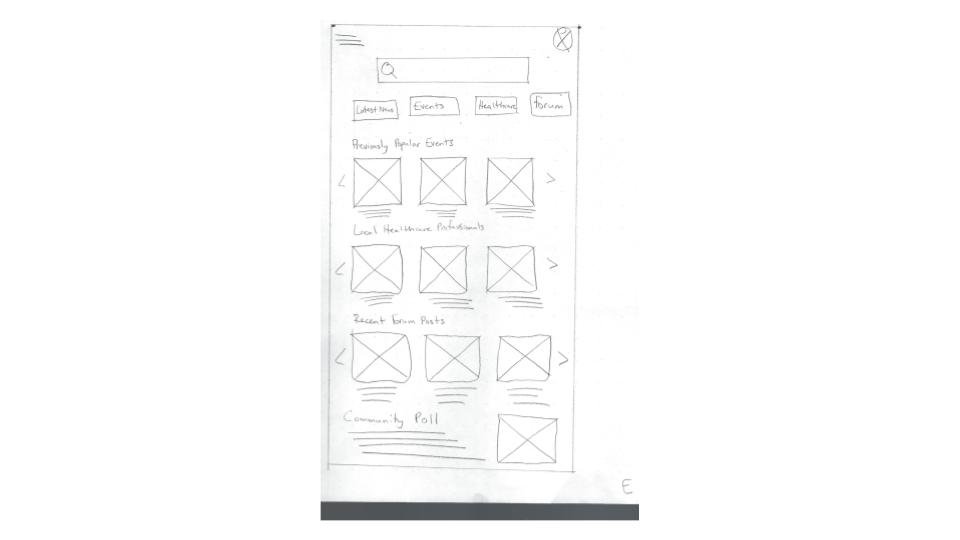

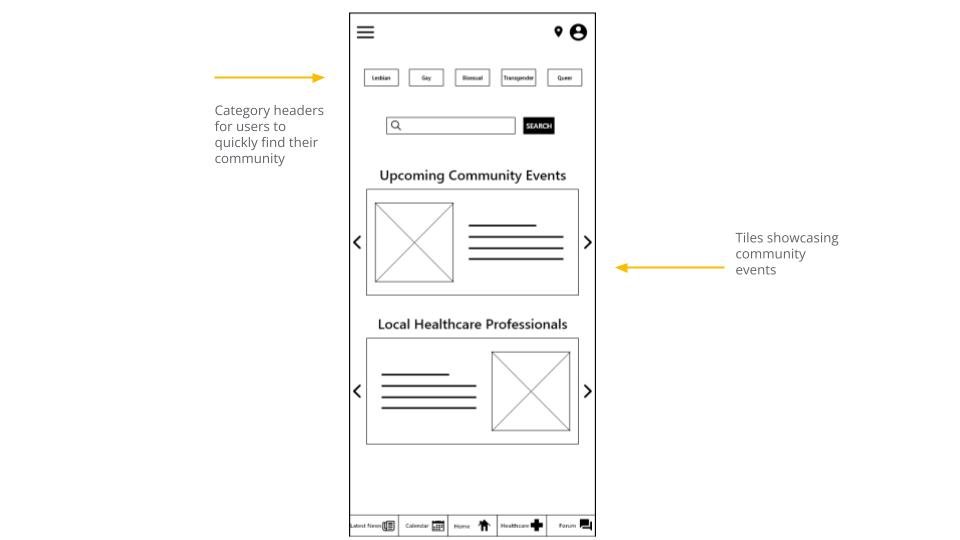

When converting paper to a digital platform, I focused on elements that would be most likely to attract users and grouped them together at the top and bottom of the page. I also included tiles for events and healthcare professionals to give the user flow a shortcut and reduce the amount of time users spend searching for what they need.


I also created a responsive website version of Always Pride’s mobile app. I started with sitemaps that showcased how the structure of the responsive website will most likely follow a combination of the Hierarchical and Matrix models. The website will follow the Hierarchical model because content will be broken down info homepage headers such as Lesbian and Gay and these headers will be further broken down into smaller sections, based off of what a user is searching for. The website will also follow the Matrix model because users will be able to follow their own path to arrive at the same destination to complete their user flow because the content will be linked throughout and able to be accessed in different ways.

Responsive Website (Phone)

Responsive Website (Tablet)
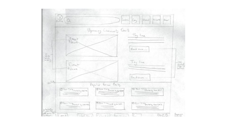
Responsive Website (Desktop)
Because I am designing with progressive enhancement in-mind, I held a “mobile-first” philosophy. After I created wireframes for the mobile app, I drew up wireframes for the responsive website to be viewed on mobile phones, tablets, and desktops. I took all of the important components from the mobile app and included them in the responsive website version. Originally focusing my designs on a how they would appear in a mobile app helped me concentrate on what elements users will want to always have at the forefront of Always Pride’s service.
Prototype
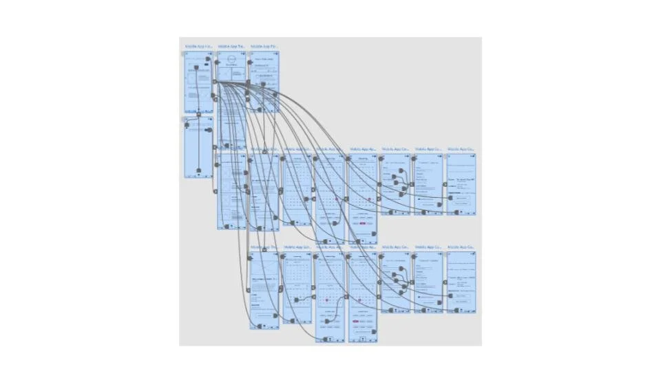
The user flow for the low-fidelity prototype follows the process of scheduling a doctor or therapist consultation. Users are able to reach the same end result by taking different avenues in the user flow, whether they use the search function or browse the forums.
After the usability study, the low-fidelity prototype was improved upon and turned into a high-fidelity prototype based off of feedback. The user flow follows the same process and includes necessary visual elements such as typography, colors, and images.
View Always Pride’s high-fidelity prototype.
View Always Pride’s low-fidelity prototype.
Lo-fi prototype

Hi-fi prototype
The usability study took place between the designing of the lo- and hi-fi prototypes. Its purpose was to determine whether or not users were able to complete the user flow of booking a consultation with a healthcare professional. Feedback from participants in the study provided insights as to what improvements needed to be made when moving to a more detailed hi-fi prototype


The most important insights, Priority 0 and 1, were used to improve the design during the high-fidelity prototype phase. Insights came mostly from user feedback that expressed a desire to be able to clearly see the important elements in the mobile app.
Mobile App Mockups


Responsive Website Mockups

Desktop

Tablet

Mobile Phone
Conclusion
I compared my “final” version of Always Pride’s mobile app with my goal statement to determine if I kept myself on the right track, design-wise, and to see if the user flow was as straightforward as I could possibly make it as this phase of the project. I believe that I kept the user at the forefront of my mind and the project because after the second usability study, users advised that an app like Always Pride’s made them feel as if they could easily connect with other LGBTQ+ people and create a support system for themselves. A couple of user expressed sincere excitement about the possibility of an app like this being actually created and added to the app stores for mobile devices.

Final Thoughts: Throughout this process, I’ve been reminded that having the opportunity to build a community with other people such as yourself, particularly marginalized people, is something that many don’t have the opportunity to do, especially with the current global pandemic. Giving people the opportunity to build connections online, and later in real life, is essential for one's mental and social health, regardless of whether or not they are a part of the LGBTQ+ community.